When Does Air Pollution Get Dangerous?
In 2020, the Western Wildfires have generated particularly high levels of air pollution in a wide area across the US, which can lead to serious health issues.

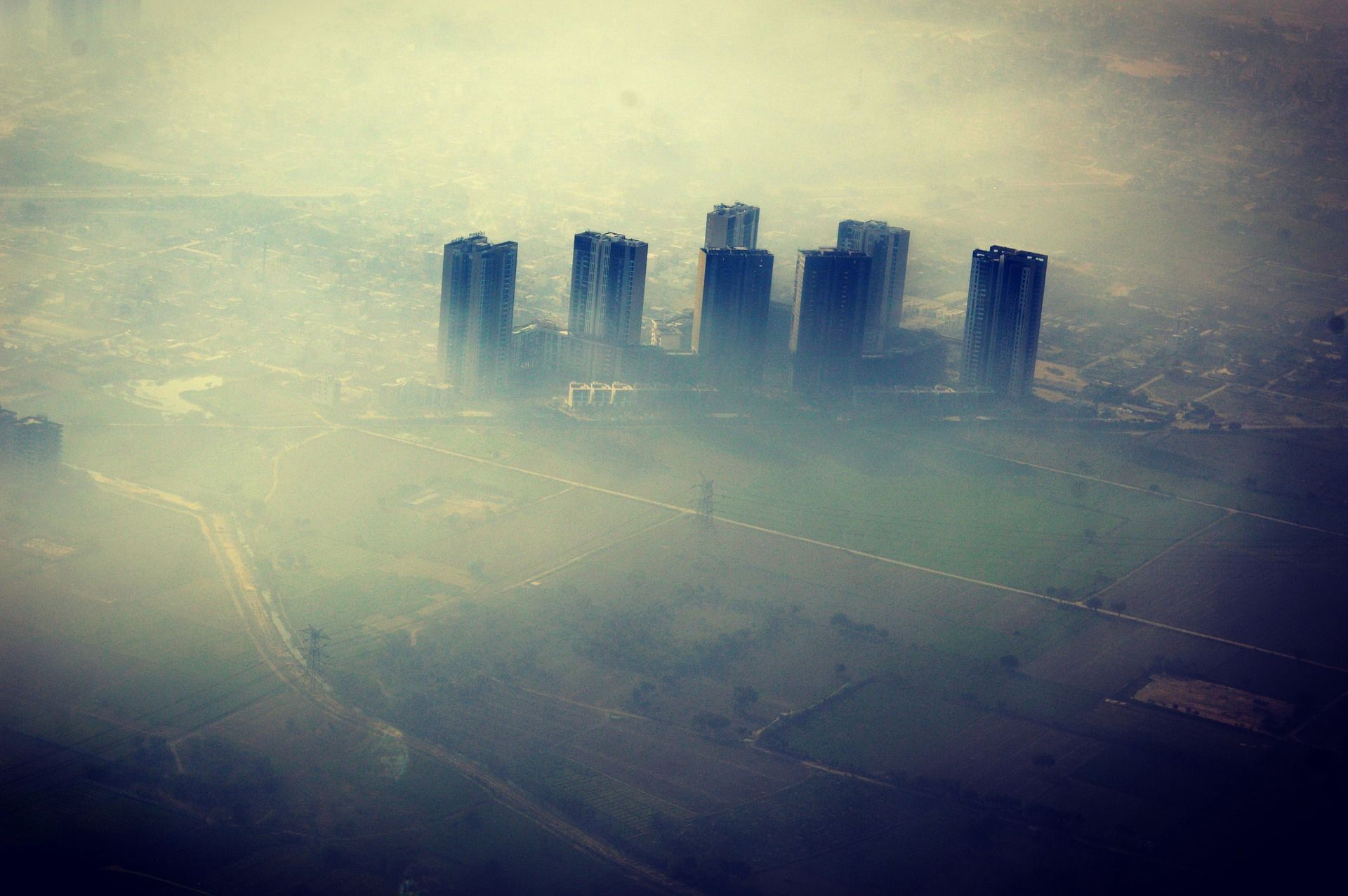
In 2020, the Western Wildfires have generated particularly high levels of Particulate Matter in a wide area across the US (PM2.5, for the finest particles, and PM10). This is a concern, as air pollution can lead to serious health issues.
Air pollution caused at least 8.9 million deaths globally in 2015. Why? Because such particles are fine enough to infiltrate our respiratory system. According to the World Health Organization, exposure to particulate matter can lead to respiratory and cardiovascular morbidity and more frequent hospital admission through asthma aggravation, respiratory symptoms, diverse cardiovascular and respiratory diseases, and lung cancer. In Mumbai, India, health costs from air pollution have been estimated to amount to $8 billion in the year 2012 alone.
Air pollution can present a significant threat to our health. Luckily, institutions like AirNow - created by the U.S. EPA, NOAA, etc. - put together Air Quality Indexes (AQIs) that translate air concentrations into figures that can be interpreted. For example, 50 µg/m3 - ‘Unhealthy for sensitive people’.
The AQI links air pollution levels to the potential health concerns. AirNow describes an AQI of 60 as moderate, adding: ‘Air quality is acceptable. However, there may be a risk for some people, particularly those who are unusually sensitive to air pollution.’
Here is what the situation looked like during the Western Wildfires, on September 15th, 2020:
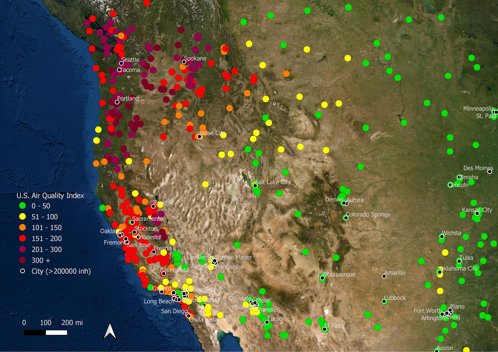
On September 15th, 2020, most of the air pollution monitoring stations in the West Coast experienced AQIs considered 'Unhealthy' (between 151 and 200, appearing in red), 'Very Unhealthy' (201-300, in light purple), or even 'Hazardous' (300+).
Which brings us to an interesting point. Different countries use different AQIs, and different thresholds define what is ‘dangerous’ for us. A fascinating article, recently published by Airmine, informs us about those differences. The following figure, reproduced from their report, is particularly informative:

This figure shows the link between ambient PM2.5 concentration and AQI values. In other words, it tells you whether a given concentration is dangerous for you - or not. Interestingly, what is considered ‘Moderate’ in the U.S. can be considered ‘Poor’ in some cases in the EU… and what is ‘Good’ in India can be ‘High’ in Norway.
In these circumstances, it can be difficult to be confident about the long-term risk exposure of living our daily life. A harmonization based on scientific consensus would be more than welcome here. When in doubt, the U.S. AQI offers straightforward interpretations of the AQI values you will find on AirNow, with intuitive categories (‘Good’, ‘Moderate’, ‘Unhealthy for Sensitive People’, etc.).
Besides, if you care about air pollution, a number of tools are available to check the air pollution levels around your home. AirNow publishes daily AQI maps and real time data that can be used to check the current air quality in your neighborhood. If you are interested in medium term statistics about air quality at your location, you can also check out our Air Pollution Assessment. It is based on air pollution records at the nearest recording stations in the last three years. We have also recently released a free risk assessment at the county level that includes insights about the last year air quality records in your favorite county (and all the others). Feel free to check it out!